
Goalkeepers Report 2019–2021
Client: Bill and Melinda Gates Foundation
Collaborators: Graphicacy (2019), Stamen Design (2020, 2021)
• data storytelling • data visualization • story shaping • facilitation • illustration •

Discovery
Each year that I supported the Goalkeepers report, we started 8–9 months before publication with a core theme and a rough idea of the supporting data that will inform the story. We spent several weeks mapping out our questions on the topic, gathering and analyzing the data, and exploring the type of visual language we might want to use.
Results of a creative discovery session where everyone drew their own mental picture of our topic
Early whiteboards depicting the start of a multimedia online report
Storyboarding
Once the general shape of the story begins to come together, we map the different layers of the narrative in a more detailed, linear fashion. In 2019 we still had the luxury of working in person, so we set up a conference room for a week at a time and the board would evolve multiple times a day. In 2020, COVID hit and we scrambled to acquaint all of the report collaborators with a virtual whiteboard space, which we began to call our “story dashboard”.
Different Layers of a narrative mapped out on a whiteboard

A Mural WHiteboard Space with a very early storyboard for the 2021 report
Concepting
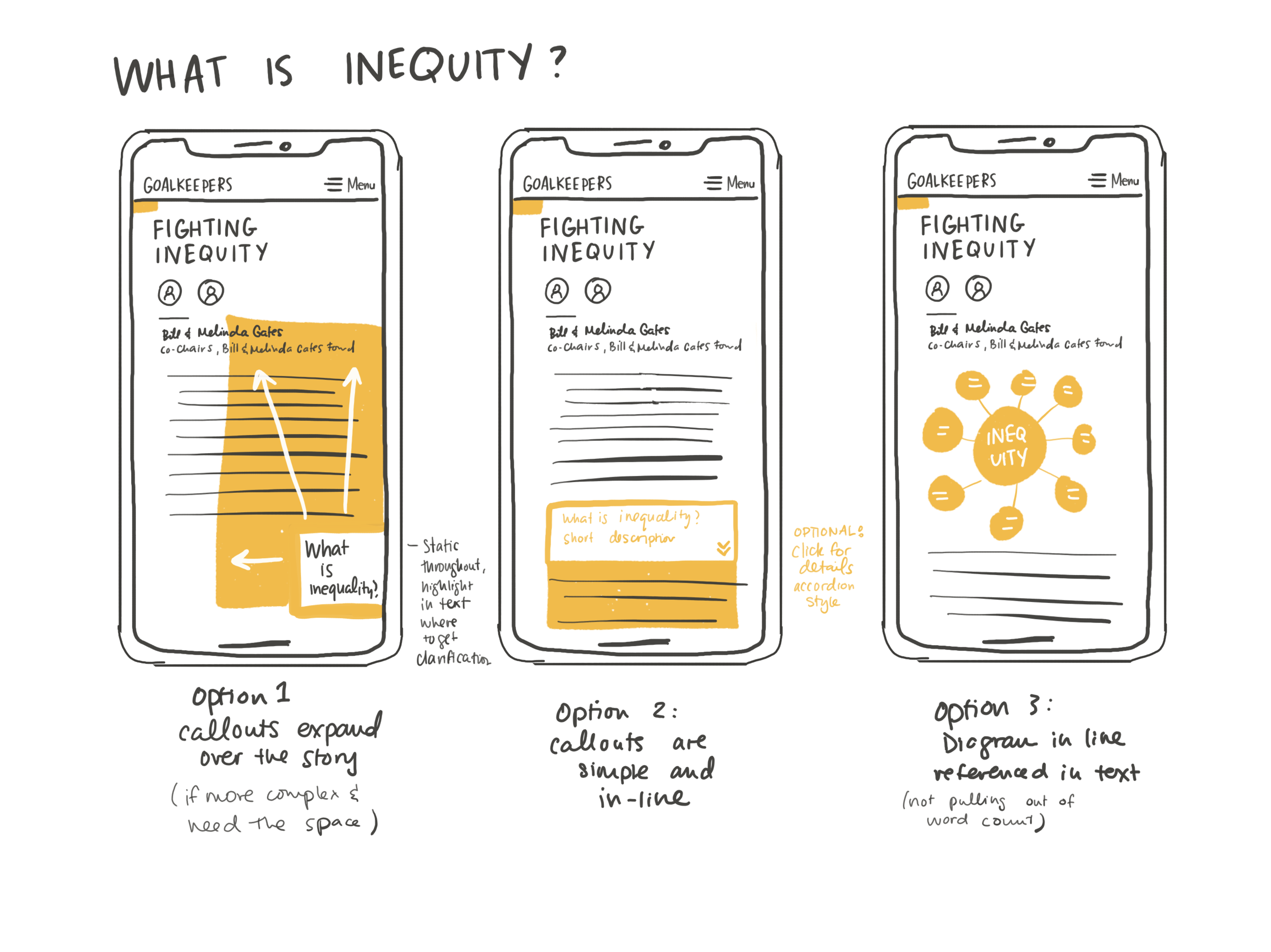
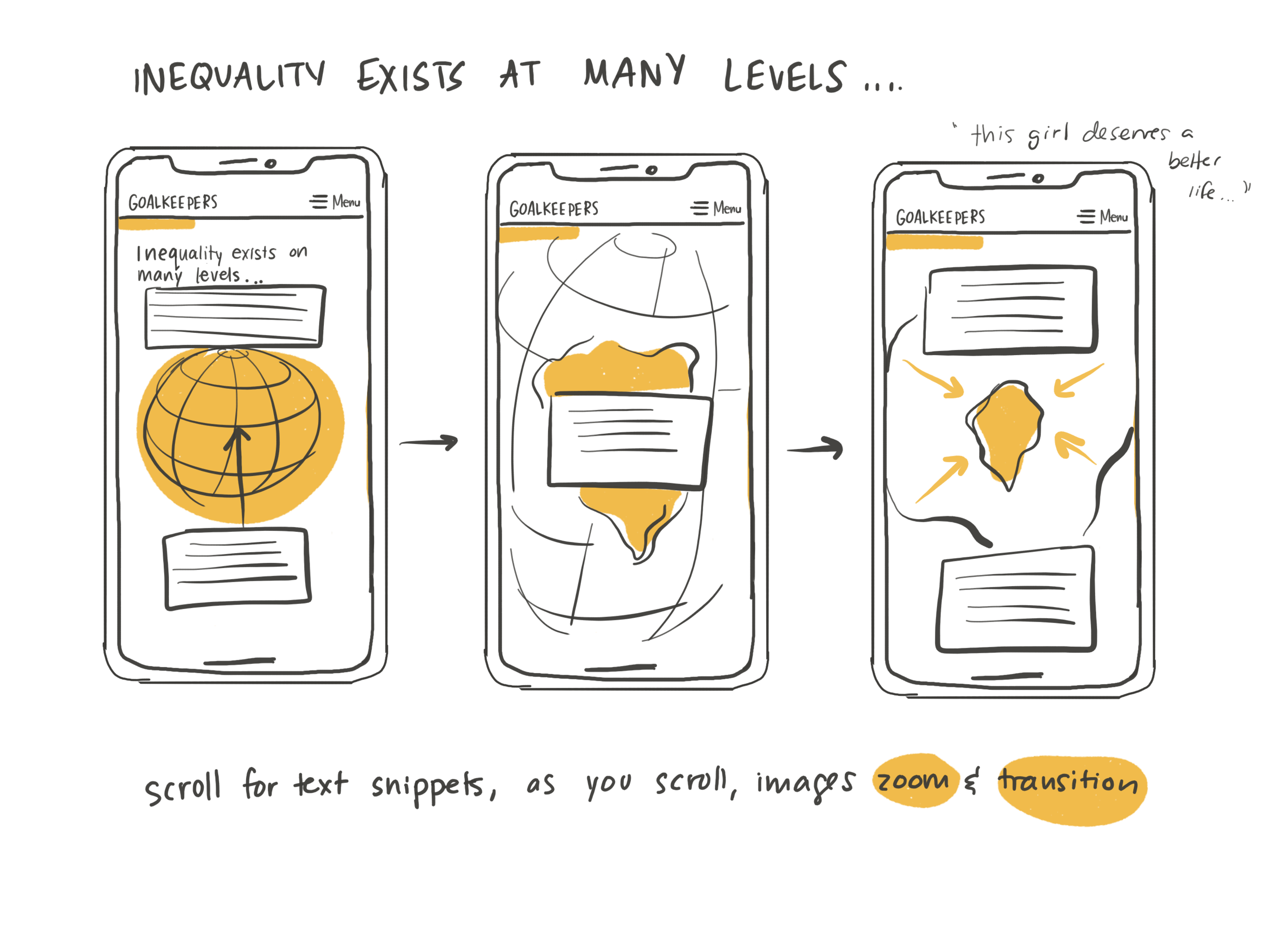
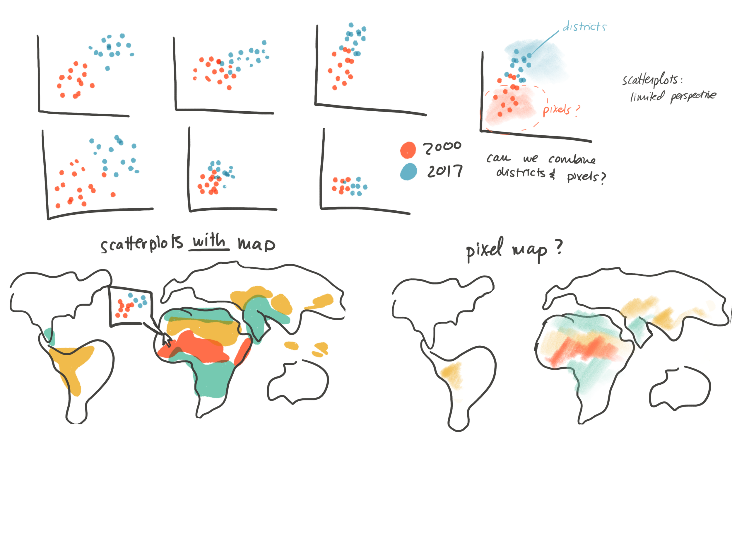
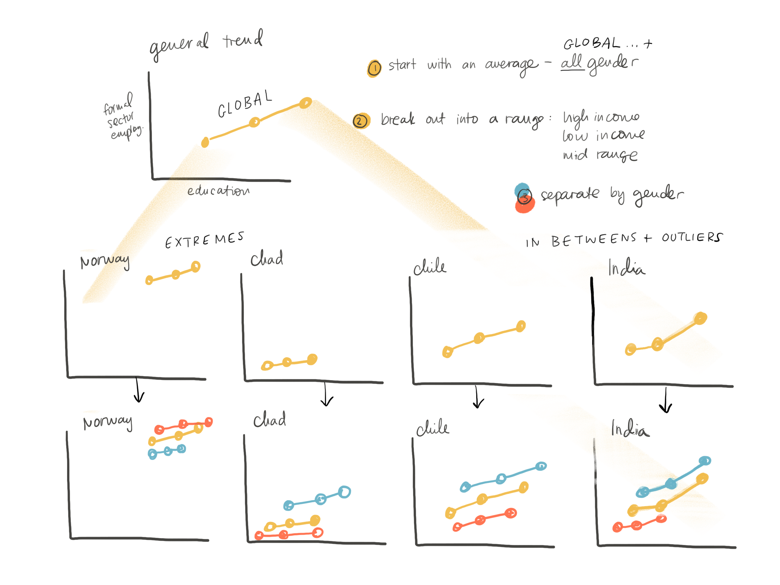
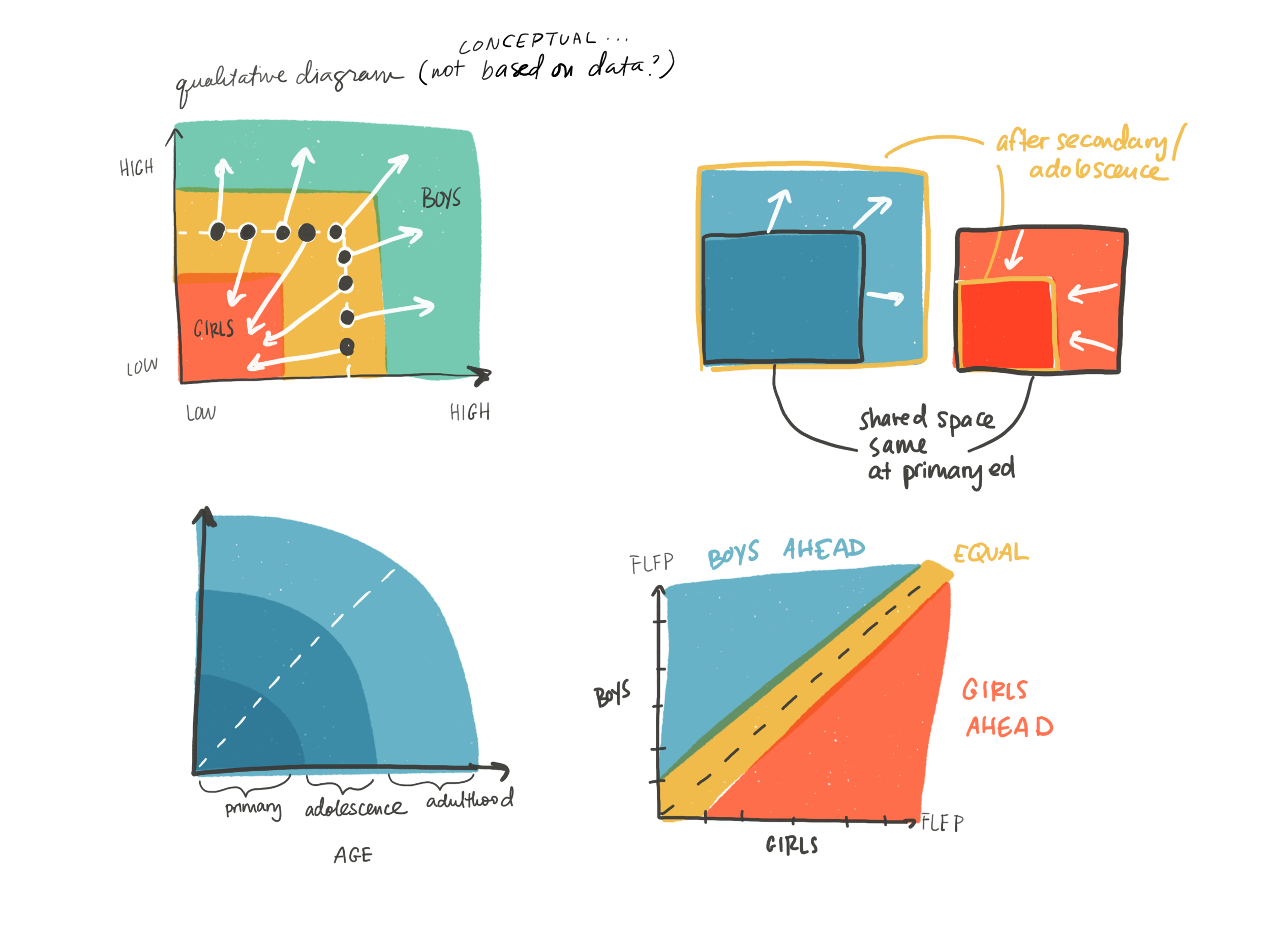
Once overall story started to take shape, we interrogated the visualization ideas in greater detail. We also imagined how some of the concepts would come to life on different formats and screens. I listened for ideas from the group and sketched out ideas in a frenzy— the aim was to present at least three concepts for each visual at the start, and to get more precise with each round of reviews and feedback.
Design & Deliver
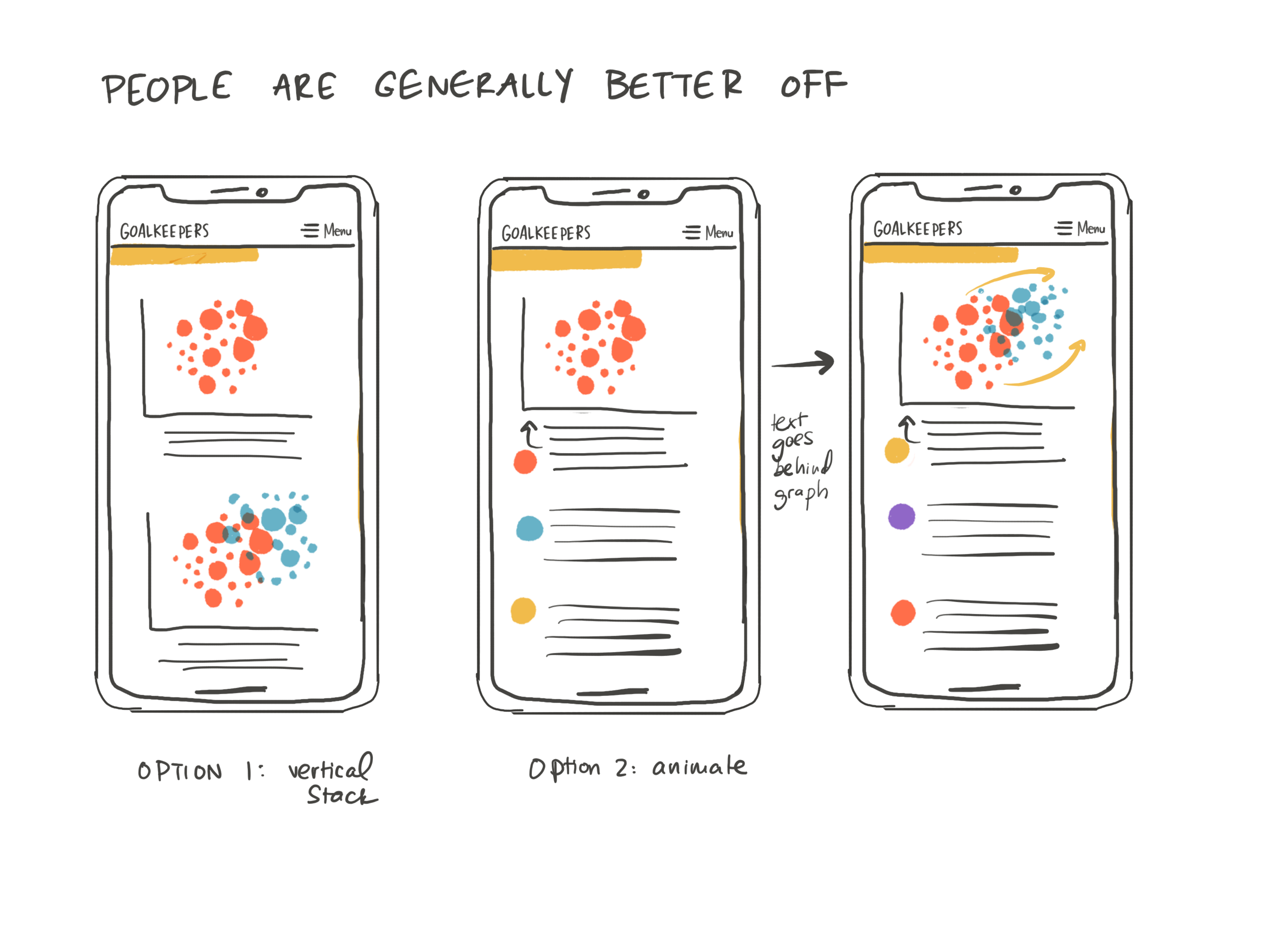
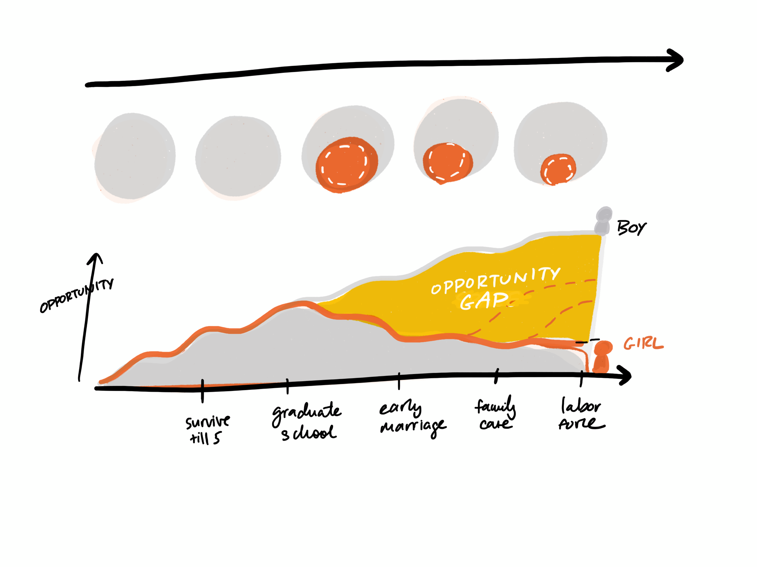
Rapid iteration was the name of the game (lucky for me I love this!) — and for each visual we gradually worked our way towards a form that most clearly and accurately conveyed the idea that we wanted to communicate. In 2019 we made the decision to integrate my hand drawn graphics for any conceptual visualizations to distinguish them from the statistical charts that were rooted in quantitative data.

A single visual goes through dozens of concepts, moving towards a singular form that we tweak until we can tweak no more
Year over year working on Goalkeepers, we strived to remind readers that there are actual human beings behind and inside of the data we are visualizing. That’s why you’ll see a lot of people interacting with the different shapes in the illustrations in 2019, portraiture and featured stories in 2020, and human form iconography in 2021.

A scroll through the 2019 Goalkeepers REport
Dream
Once the dust settled after launching the report each year, we gathered to reflect on the work. Unfortunately, the ideas we mapped out for the next year’s report were never able to come to fruition because we were hit with the most chaotic and disruptive time in modern history— that none of us could have ever dreamed up.
Now that I’ve had even more space to reflect, I’m in awe of how we navigated these events, adapted our lives, and completely re-envisioned the story time and time again. We waiting on late breaking data, and then had to move at lightning speed to integrate the findings into the story and create compelling visual forms. I have hundreds of pages of sketches, working visuals, and scraps of stories on the cutting room floor. I suppose my dream is that some of these ideas find their way into the world eventually.