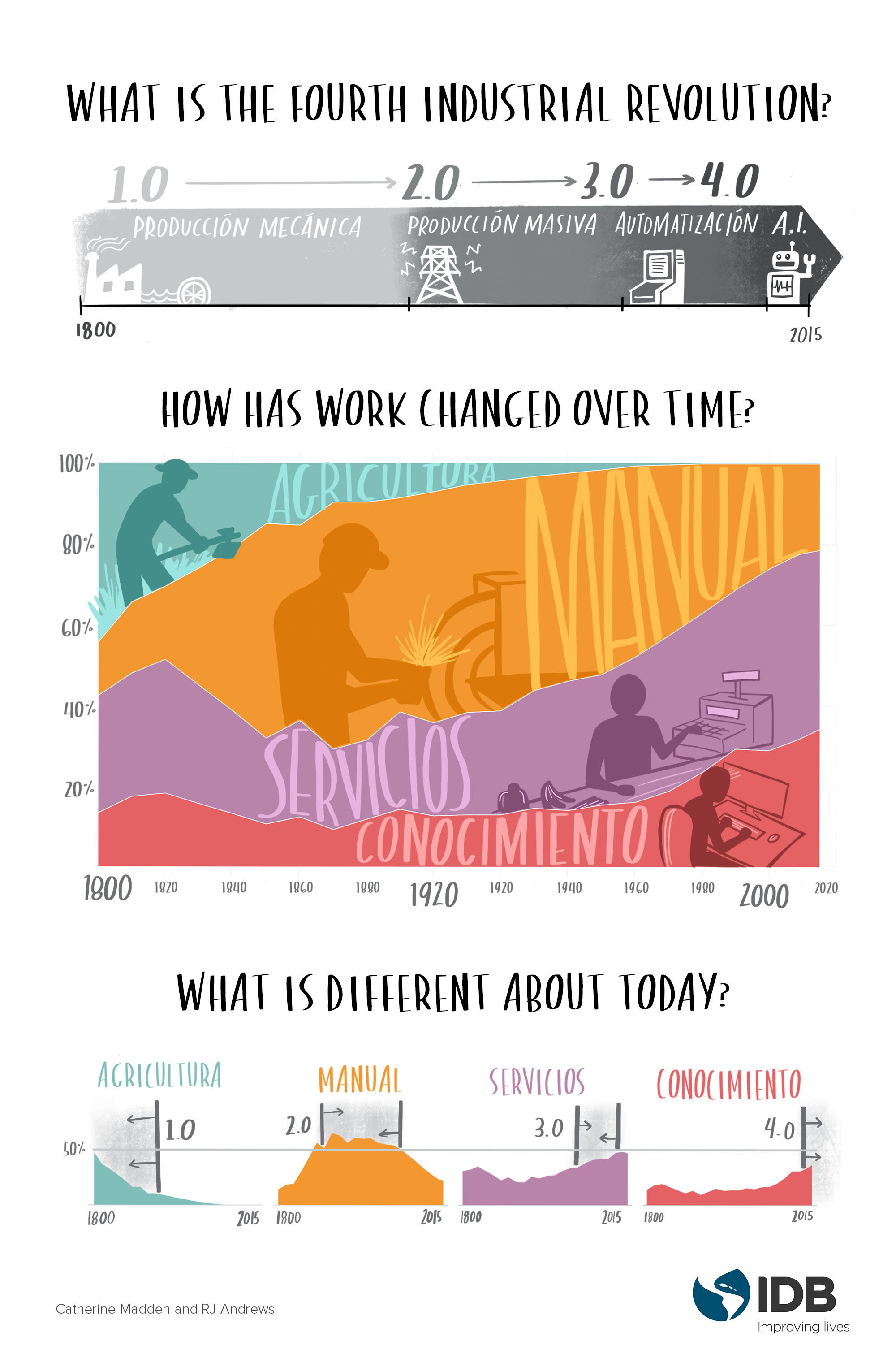
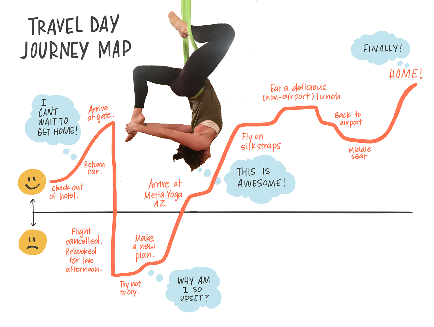
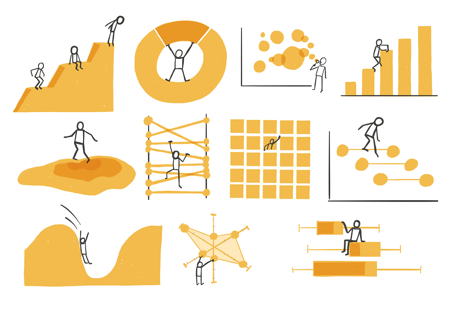
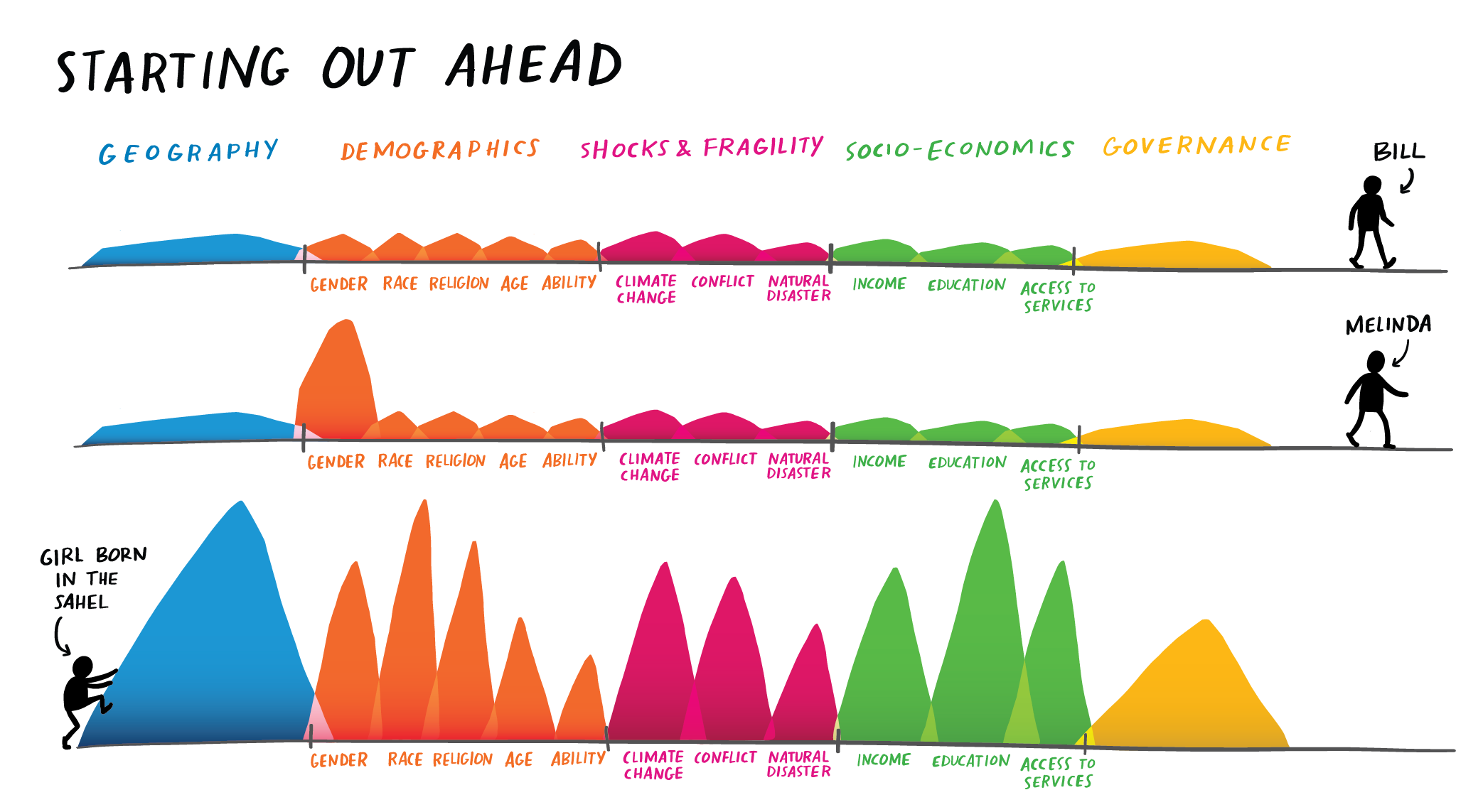
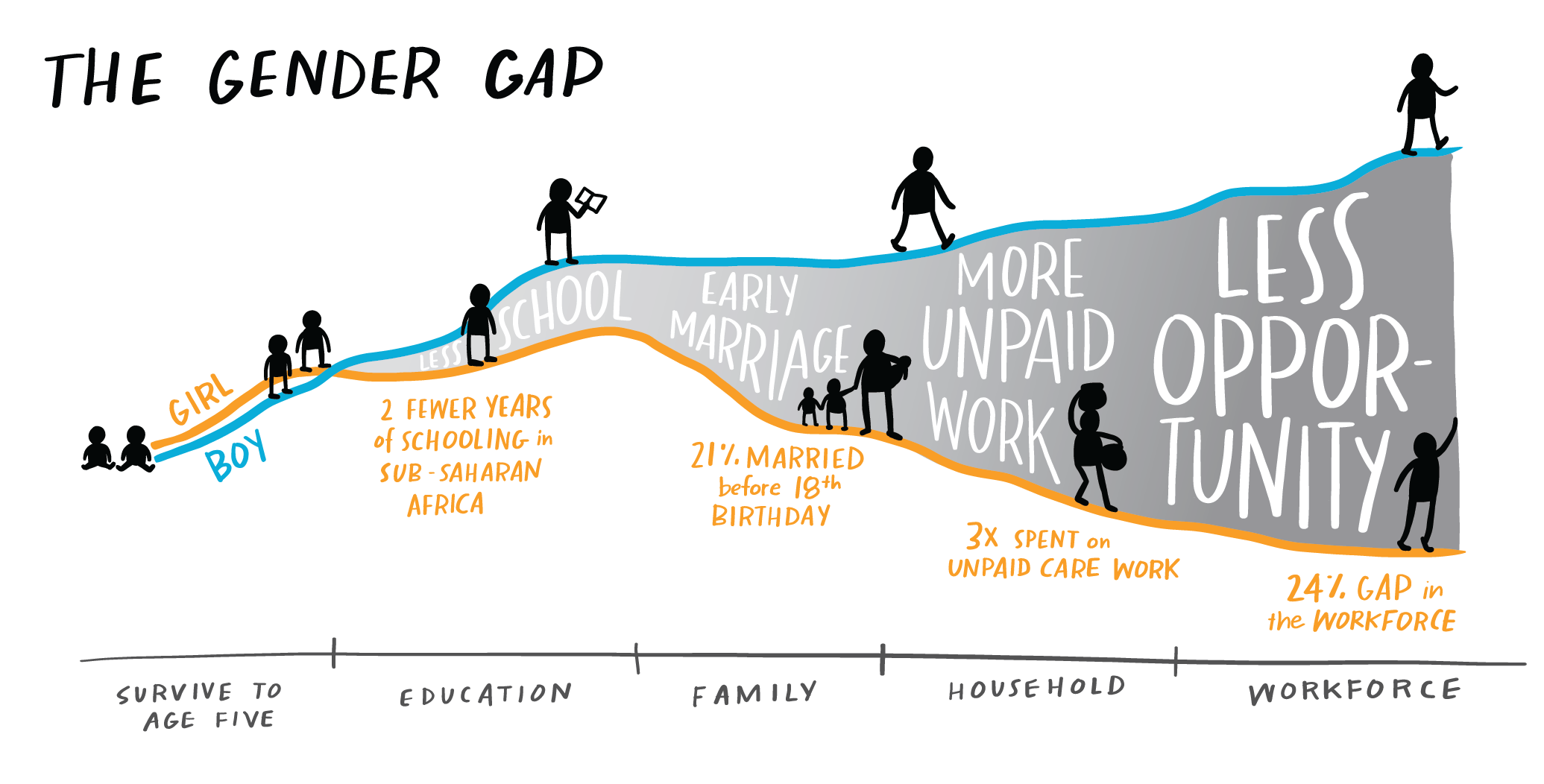
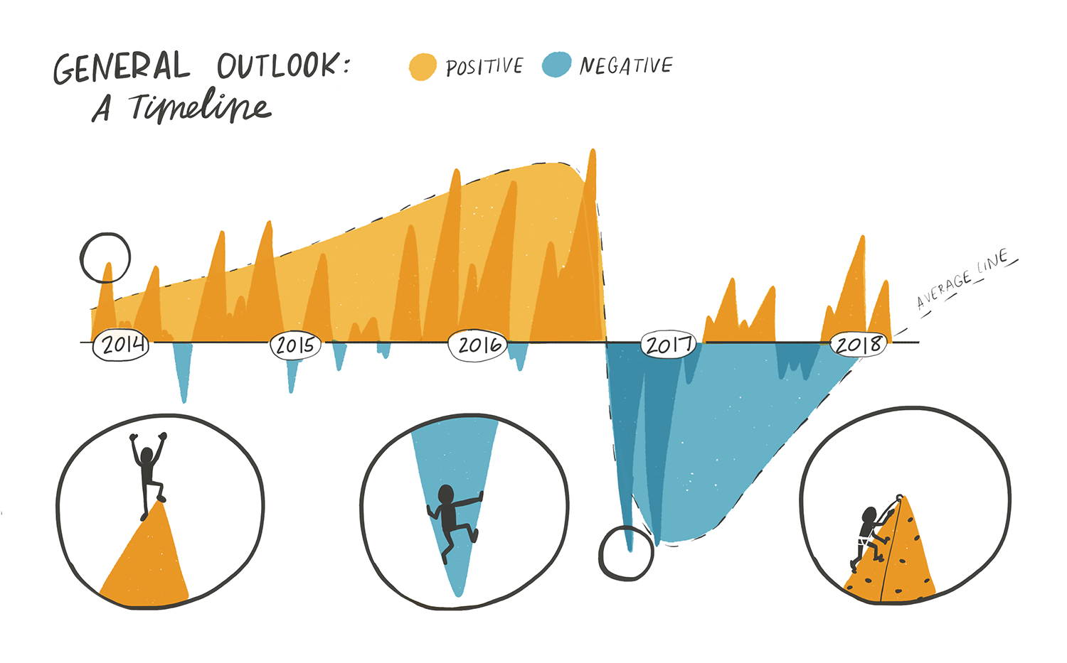
People In Charts
I have spoken about the limitations I see in the world of statistics and data, which you can watch here. In addition to the major issues with bias in data and algorithms, I think there is also a dangerous path of abstraction when you focus only on quantifiable attributes of the human condition. It leaves little room for nuance, and creates a division between the actual subjects of a database or study, and the decision makers who are supposed to be using the numbers to create change.
Lots of my clients are talking about this, too. When working with larger teams and datasets, we always set aside time to make sure we are keeping the humans in the data. You’ll see this in my work in two ways:
Using hand drawn approach, which implicitly reminds you that there is a (fallible) human being who created what you are reading
Incorporating figures in, around, or near the statistical graphics as a reminder of where the data came from
Take a look at some examples I’ve created over the years.