Jobs of the Future Project
/1st foray into #dataJournalism and we're on the front page of @el_pais: history, tech, jobs!:https://t.co/AKYhtNX4ny
— RJ Andrews (@infowetrust) May 1, 2017
Congrats @catmule 🍾 pic.twitter.com/9Omy88T5oR
This week I wrapped up a fun commission to create a data story + illustrations about the future of jobs. The project was sponsored by the Inter American Development Bank and we worked with El Pais to publish the piece on May Day, or Labor Day for Spain and other Latin American Countries.
I brought in my collaborator RJ Andrews to help me think through the project. It was great to have a partner to expand the thinking and also narrow the focus at the right times. It was the first experiment in data journalism for both of us, which has left us excited to try more.
Go check out the piece on El Pais and then come back here to see how we sketched our way to the final product!
Data + Research
Data
The topic of the labor market is super expansive. You can't think about specific datasets in a vacuum without asking about things like technology, geopolitical climates, and social issues. We knew that the piece should focus on jobs and skills for the future, but we cast a very wide net before honing in on the actual story and outline.
In addition to exploring the topic visually (see next section), we researched a variety of data sources and tried to identify connecting threads.
The first thing we looked at is the history of jobs over the last 200 years. For context we read about the different techno-economic revolutions (agricultural, industrial, technological, green, digital, fourth) which transformed how we all live. We focused on defining key dates, foundation technologies, and what daily life was like for an average worker. Here's a spreadsheet RJ compiled from this information.
Then we went looking for data that could put some quantitative meat on these historic bones. The US Bureau of Labor Statistics provides a wealth of employment data, neatly organized into a categorical hierarchy. Number of jobs, job growth, annual wages, and other dimensions. We were inspired by Richard Florida to group job categories into four super-categories (agricultural, manual, service, knowledge). We also relied on his research presented in The Rise of the Creative Class to join historic data going back to 1800 to modern job categories.
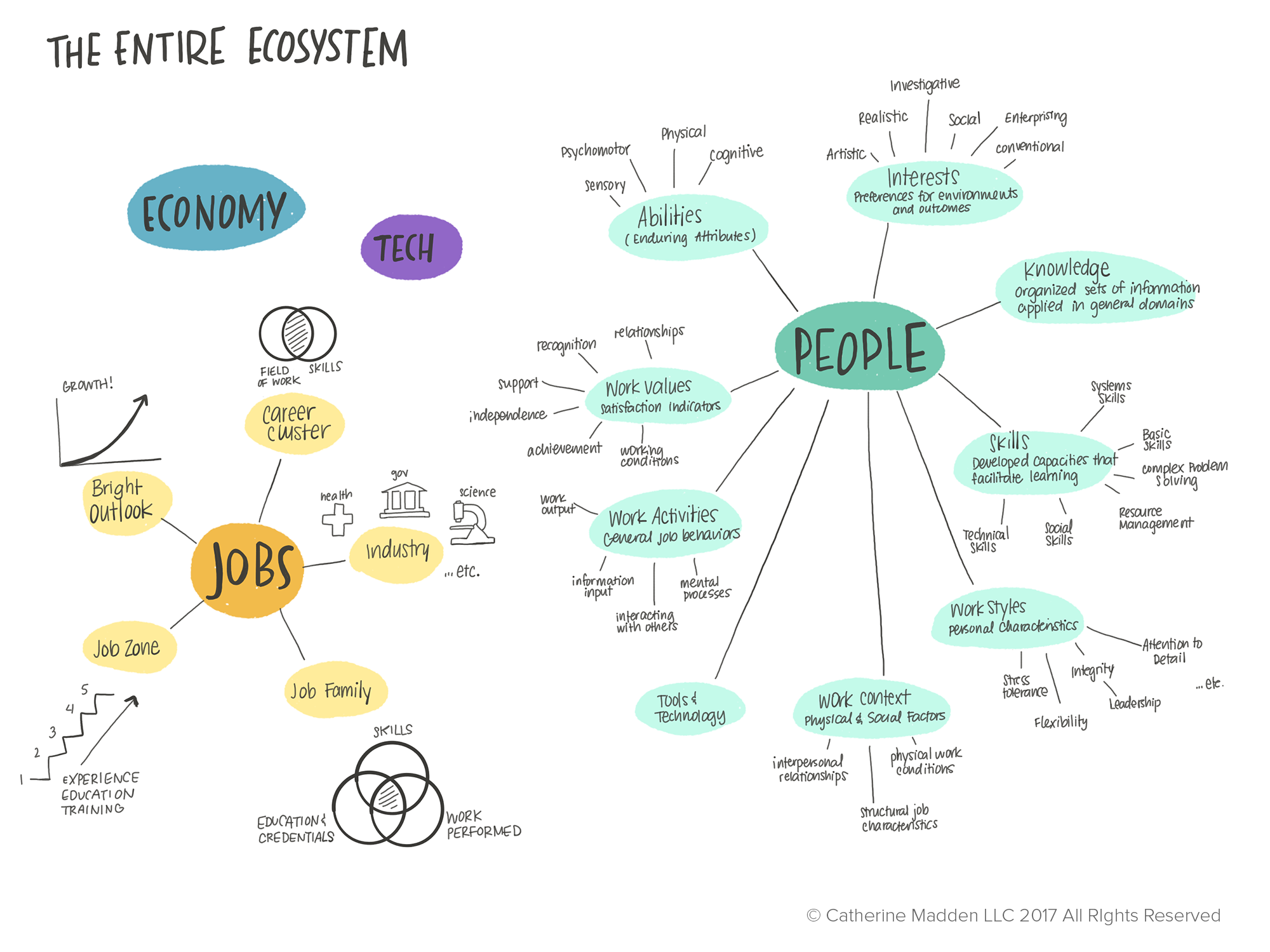
Now that we had a rich high-level overview of where jobs were today, and where they had come from, we sought data that could give a bottom-up perspective on information relevant to a modern worker. O*NET Online, sponsored by the US Department of Labor/Employment and Training Administration, provides data-driven career exploration tools at no cost. It is a survey-driven database that includes practical information structured under a content model that includes knowledge, skills, and abilities. We rounded out our research by reading the World Economic Forum's Future of Jobs report, the Economist's Lifelong Learning report, and IDB's Apprenticeships for the XXI Century report.
Visual Research
This isn't a new topic-- it has already been visualized in many different ways. It was important to compile a visual library to reference for inspiration on the most effective ways certain elements were visualized and alternative approaches and formats.

A Pinterest board of "Industry 4.0" Timelines
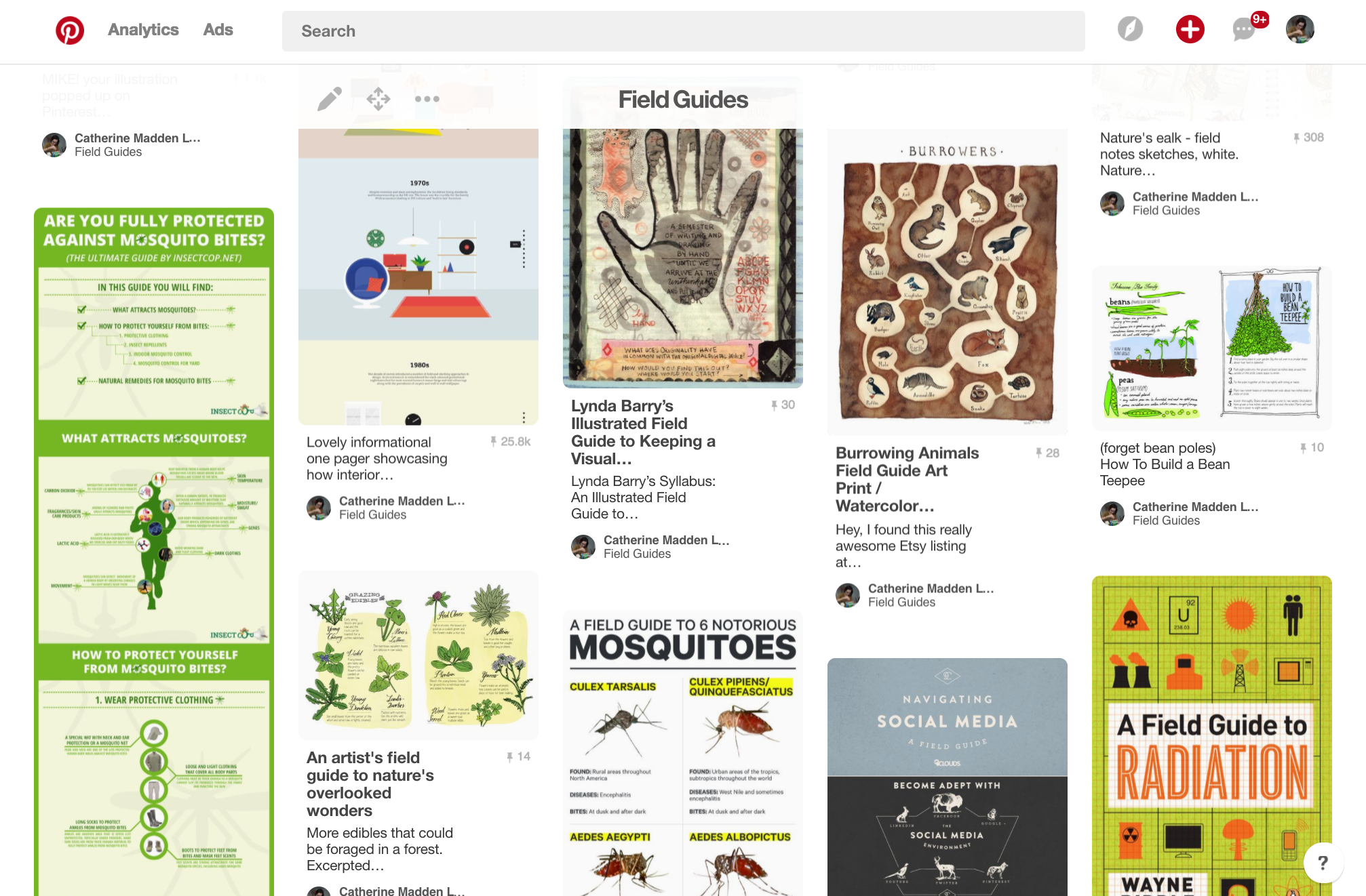
A Pinterest board of visual Field Guides
The Outline
The Relay method is all about visualizing possibilities through drawing. That doesn't mean I don't explore data and organize my thoughts without actual visualization or presentation software, but the most valuable part of the process takes place on (digital) paper.


Part 1: The History
The first chapter of our visual story focuses on the fact that today's situation of automation and the decline of manufacturing is not actually unique when considered in the history of previous industrial revolutions. We wanted to explore what technologies were introduced, who was impacted, and how quickly the labor markets changed over all four revolutions.


Part 2: Jobs Today
The second part of the story visualizes where we are today in the jobs market. Building off of part one, where you see clearly that service and knowledge work are on the incline, we wanted to visualize that these two occupation groups actually have a much different character when you dig deeper. How much earning potential does each category have? How many actual jobs are available? Where should people seek work?


Part 3: Skills
The final part of the story focuses on the future. The one question most people want to ask is "What skills do I need?" but the answer is not what they expect. We wanted to communicate that rather than focusing on a specific technological skill (i.e. programming in Python or csharp) you should focus on softer skills like flexibility, adaptability, and most importantly, the ability to learn.


The Final "Field Guide" Images
While they ended up as three fairly simple images, you now know that the process to creating them is much more in-depth!


The Chopping Block
Here are a few of the many different ideas for visualization that never made it past the doodle phase.


